Easily accessible charts
Several of Focalcube’s modules offer easily accessible charts that summarize real-time data. For example, the ticket module provides a charting tool where ticket flows can be visualized, stratified by metadata. Quality deficiency costs recorded at the ticket level can be visualized, for instance, in Focalcube Organizations.
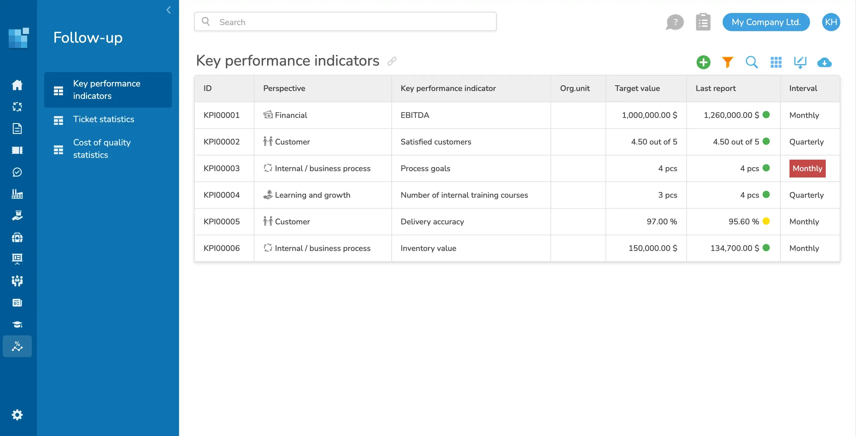
KPIs and automation
Focalcube can be used to set up key metrics for manual data input, which is often useful for metrics where the data source is not in Focalcube and no integration has been set up.
With Focalcube Follow-up, you can also configure advanced automated metrics with mathematical processing. These key metrics are automatically calculated by Focalcube at the intervals you configure. The calculation engine in Focalcube Key Metrics can also process data from integrated systems.
Excel export
If the built-in tracking tools don’t fully answer your questions, it’s always easy to export a dataset to Excel, where you can further analyze your data.